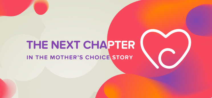
The Next Chapter
The Next Chapter
Who We Are
What we have learned
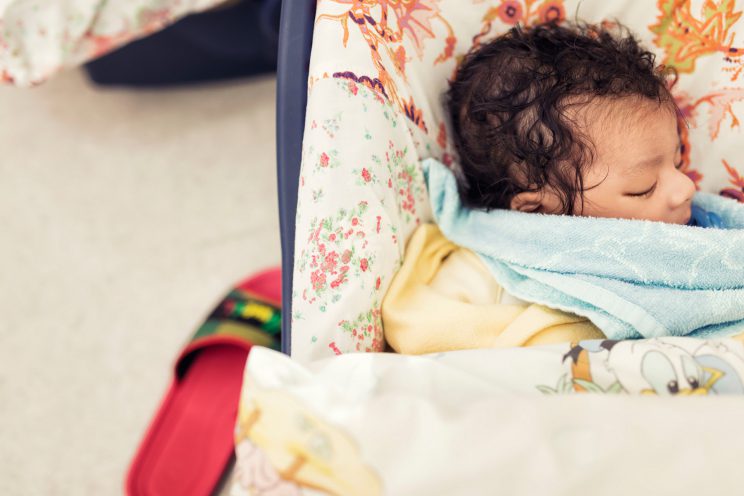
Over the years, we’ve learned a lot from working with the vulnerable girls and babies that we serve. Despite the challenges that they’re up against, we have hope for their future. We’ve learned that it is in “family” – a safe, loving, and permanent family – where their life stories can be changed. We’ve also learned how powerful a community can be, and the many different ways that the community can engage with the issues that we face. We believe that it takes a village to raise a child, and that everyone has a role to play in serving the most vulnerable in our city.
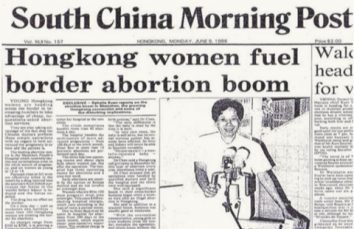
(1987 – June 2016)
New Logo Concept
(New logo starting July 2016)
![]()
Where we are going
Now, nearly three decades on, we are challenged to take a hard look how to serve more children, youth, and families, because the need for our services is only growing. We don’t just want to be there at a point of crisis for young girls and children, we want to see a community so supportive of pregnant teenagers and children without families that they open their own hearts to help, and organizations like Mother’s Choice are no longer needed. We want to put ourselves out of business!
For this to happen, we need to be a catalyst for positive social change. The issues we tackle are complex. From teen pregnancy to children living in institutional care – there is no way for a single entity to achieve large-scale change in these areas. It will take many individuals and organizations working together to bring lasting change. It will take all of us!
Our new vision is bold, but we have hope that together, we can make it a reality. That’s why we’ve worked hard to redefine our identity to reflect a picture of the future we want to see. Our new logo symbolizes not only the embrace of a family, but also the support of a community that wraps around those most vulnerable in our city. Our color palette of rose, purple and pumpkin, reflects the warm and hopeful welcome that we offer to our clients who need us.
Over this next year, you will see updates to our website and materials that will be a better reflection of our work and our spirit. We are full of gratitude for where we’ve come from, and excited for what is to come.
VISION
Every child in a loving family.
MISSION
Joining hands with our community to give hope and change life stories.
CORE VALUES
Hope, Courage, Relationship, Community, Catalyst.
It takes a village to raise a child, and
Hong Kong needs your help more than ever.
Will you join us on the journey?
Mother’s Choice 2016 ReBrand Frequently Asked Questions
1. What’s the story behind the rebrand?
Over the years, we’ve learned a lot about the needs of the most vulnerable girls and babies and how we can effectively serve them. Recently, we have been challenged to take a hard look at the way we serve girls and babies in Hong Kong, because the need for our services is only growing. We don’t want to just be there at a point of crisis for young girls and children, we want to see a community so supportive of pregnant teenagers and children without families that that they open their own hearts to help, and organizations like Mother’s Choice are no longer needed.
For this to happen, we need a social movement. The issues we face, from teen pregnancy to children living in institutional care, are complex – there is no way for a single entity to achieve large-scale change in these areas. It will take many individuals and organizations working together to bring lasting change. It will take all of us!
We are passionate about our vision, and we want to see it reflected in our visual identity. A picture of a bold future where every child in Hong Kong is in a loving family.
2. Why do we need to rebrand?
It’s important to have a clear brand at Mother’s Choice for many reasons. A clear organizational identity and communications system helps Mother’s Choice to:
Reach potential girls and children who need our help,
Find members of the community who can be our volunteers, partners and champions,
Raise resources to support our operations and services.
3. What does the new visual identity represent?
Our new logo symbolizes the embrace of a family, and the support of a community that wraps around those most vulnerable in our city. Our new color palette reflects the warm and hopeful welcome that we offer to those who need us. Our Chinese name is more prominent in the logo to emphasize that we are a local charity.
![]()
When we interviewed many of you last year during our brand survey, almost all of you said that you felt Mother’s Choice was warm and friendly. So we chose a color palette of rose, purpose and pumpkin – warm, bright colors to reflect our welcoming and supportive services.
4. Is the name “Mother’s Choice” changing too?
We are proud of the almost 30-year legacy of Mother’s Choice here in Hong Kong. We have strong brand recognition in the community and there is a positive association of our work in the name “Mother’s Choice”. There are no plans to change the name as we want to remain recognizable in the community so that those who need our services can find us quickly in a moment of crisis.
5. How much did it cost to do this rebrand project?
We believe that it takes a village to raise a child, and everyone has a role to play. That’s why we’re so thankful for our partnerships, with Ogilvy and Brand Union, who have generously donated their services pro bono to help us create a visual identity that reflects the next chapter in the Mother’s Choice story.
Rebranding can be a very expensive project and their generosity means that we can continue to spend our funds where they are really needed – serving our clients.
There will be some costs associated with updating our materials, but after 29 years, we think it is worth investing in. Over the next year, we will be gradually updating all our materials to reflect our new identity
6. Are there any other core changes to Mother’s Choice?
There is a growing need for our services. We want to serve more children, youth and families, and we are working hard to ensure more consistency of care and that our work is sustainable and scalable. We are positioning ourselves to be better equipped to serve even more girls and babies.